Image may be NSFW.
Clik here to view.
Everywhere you look, more and more people feel they are entitled to something they’re not. I and others have written about the obscene level of entitlement some users feel is owed them when they download apps from the App Store, and to be sure this is still a huge problem today. Lately however, I’ve been observing another form of app entitlement and honestly, it has got to stop – iPhone 6 Plus users who think all interfaces should be designed to both fit their jumbo phones AND still allow one-handed use.
When Apple introduced the iPhone 6 Plus and it’s enormous 5.5″ screen, it clearly filled a much-needed gap in the iOS universe. Users had been clamoring for more screen real estate for years and when it finally arrived, they rejoiced. Over time however, these users have developed a sense of entitlement that the apps they run should place all controls at or near the bottom of the screen where they can be reached by the thumb. Sorry, but like Captain Picard in First Contact, I’m drawing a line in the proverbial sand. No, iPhone 6 Plus users don’t get to dictate interface design for the rest of us.
Like it or not, buttons at the top of the screen are not going away any time soon. Developers need every bit of screen real estate to logically lay out controls consistently across a host of device ranges and configurations. From the tiny iPhone 4 to the popular iPhone 6 and the iPad there’s a method to our madness. It might seem like a great idea if every single button, tab, actionable element and control were within thumb’s reach, but that simply isn’t possible, nor is it actually desirable.
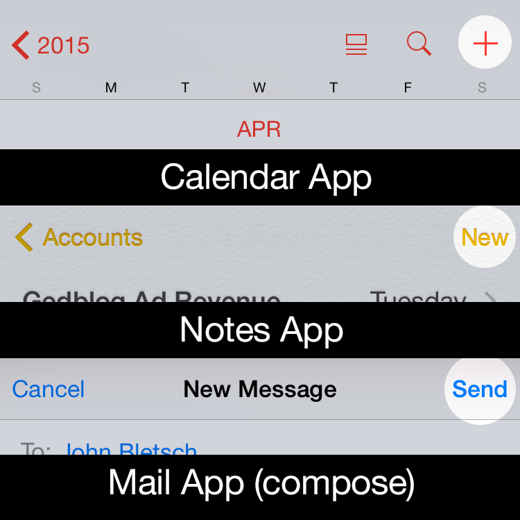
When Apple developed iOS, the experts charged with designing its interface laid out regions of the iOS screen for specific interactions. Since the entire navigation stack generally flows from left (where you were) to right (where you are going), the button for closing or going back a level is at the upper left. Creation of new content or taking action on that content, like adding a calendar event or sending an email or a tweet, is usually found at the upper right. Tab controls can be either at the top or the bottom, though generally they are usually found at the bottom. In this way, a user who picks up an iPhone 4 has a reasonable expectation that similar types of controls will appear in similar places when she picks up an iPhone 6 Plus. This helps maintain usability and UI consistency for all apps, not just those that run on jumbo phones.
Image may be NSFW.
Clik here to view.
There are ways that developers can help facilitate one-handed use when it’s appropriate. The swipe to go back gesture is a great innovation Apple introduced back in iOS 7 and is a thumb-saver on larger phones. Many apps no longer require you to reach up and tap “Back” to go back, you can simply swipe from the left edge of the screen to navigate back one level. Apple also implemented Reachability (double tap the Home button to lower the entire screen temporarily) to help reach interface elements at or near the top of the screen. But for some users, these gestures are simply not enough. The thing they forget is that by opting for a large device they gained a huge, highly readable screen but they also sacrificed some level of UI convenience. iPad users have been dealing with this trade-off for years, that’s the nature of the beast, like it or not.
When I first heard about the rumored existence of the iPhone 6 Plus and its huge screen, I wondered how Apple would reconcile its long-held tenet that one-handed use reigned supreme with that of it’s upcoming larger device. Apple even built an entire marketing campaign around the advantages of smaller iPhones vs their larger Android counterparts. But when the Plus was released, Apple quickly abandoned that philosophy in order to sell millions of 6 and 6 Plus’. Funny how that happened.
The problem with these users is that they often think like the Borg – they want the best of both worlds – larger screens and an interface that lets them use every app one-handed. As someone who designs for the screen, I’m here to tell them that until humans evolve longer thumbs that simply isn’t possible. At some point (iOS 10?) Apple may come up with a completely new interface paradigm for iOS, but in the meantime it’s best if they start dealing with reality. Whether it’s assimilating Starfleet personnel or playing with your apps, sometimes you just need to use two hands.